MindPillar
Full brand and design system development for MindPillar — a crypto trading education platform. Strategy, identity, component library, and multi-channel application built from zero.
Scope: Brand Strategy → Design System
Industry: Crypto / FinTech Education
My role: Brand Strategy, Brand Identity, Brand Design System

BRAND & DESIGN SYSTEM
STRATEGIC FOUNDATION
PRINCIPLES BEFORE PIXELS
The project started with stakeholder interviews, a brand audit, and competitor analysis. 92 mentions of "community", 33 of "trust", the questionnaire data shaped every strategic decision.
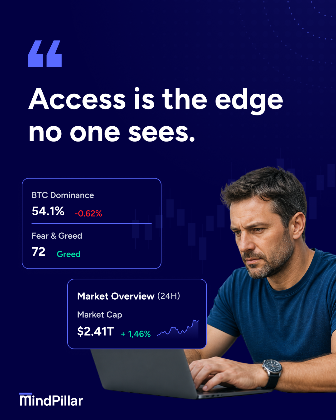
Core insight
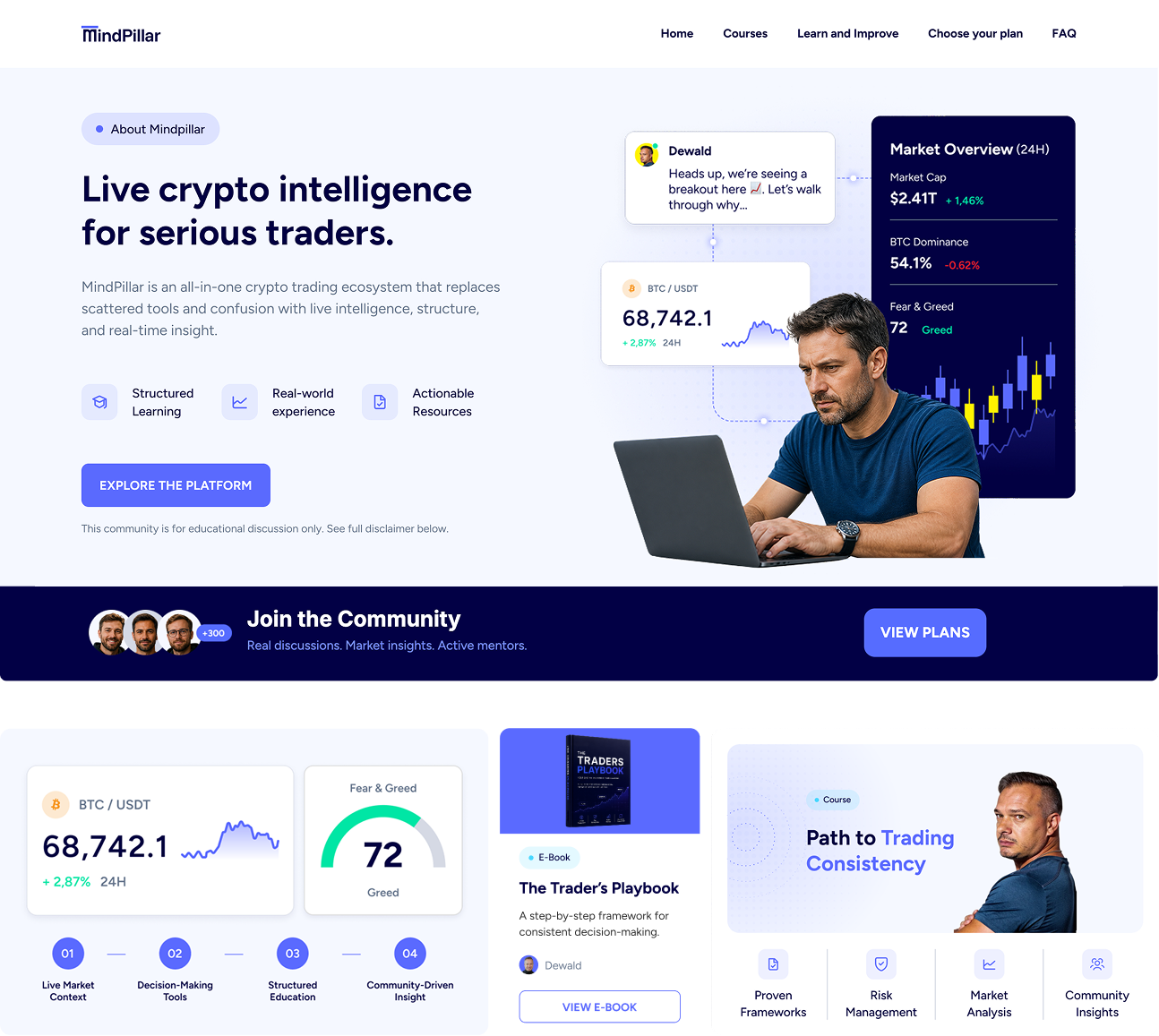
Traders don't lack signals. They lack structured access to them. Access became the brand's central idea.
Archetype mix
Creator × Magician with an Everyman accent: transformation through mastery, grounded in community.
Value structure
Education leads. System differentiates. Tools enable. Community retains. KOLs validate, not lead.
Brand principle
Clarity over complexity. System over signals. Brand over personalities. Education before monetisation.
THE PROBLEM
TRADERS DON’T LACK INFORMATION. THEY LACK STRUCTURE.
MindPillar came in with a fragmented visual identity: inconsistent UI, unclear positioning, and a brand too dependent on KOL personalities rather than the system itself. The challenge was to build something the platform could grow into.
BEFORE:

AFTER:
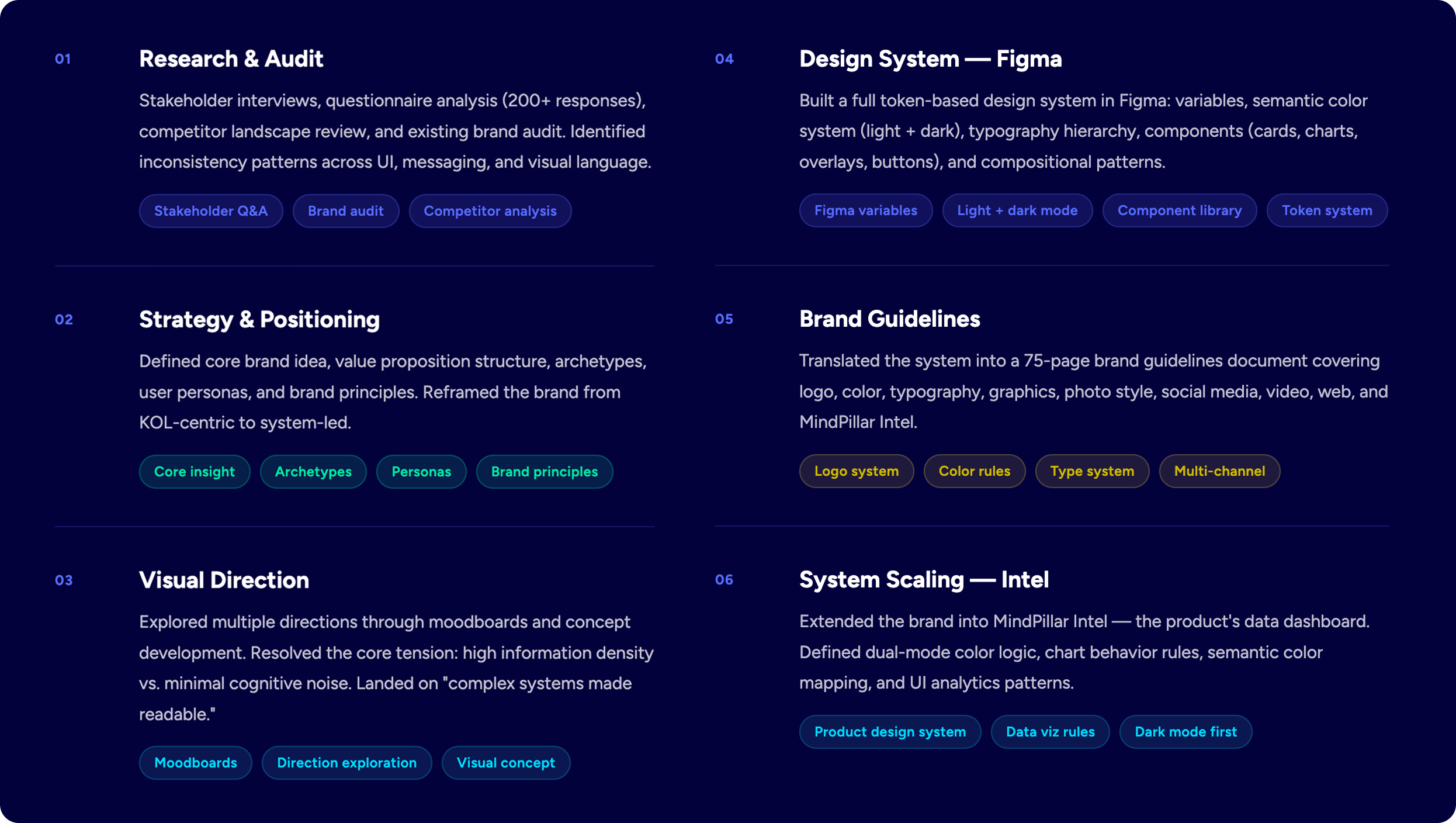
PROCESS
HOW THE DESIGN SYSTEM WAS BUILT
VISUAL IDENTITY SYSTEM
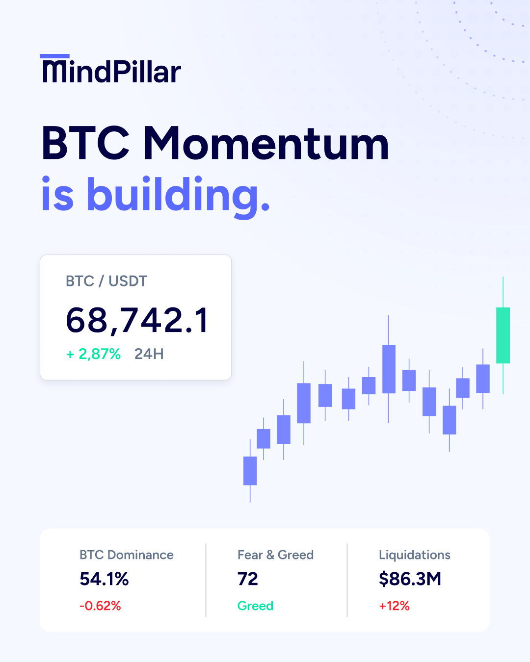
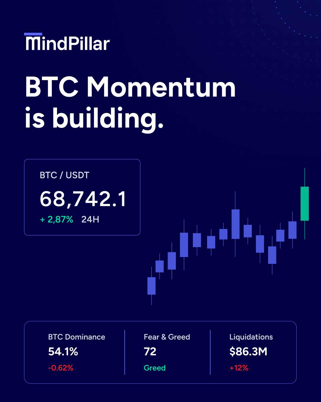
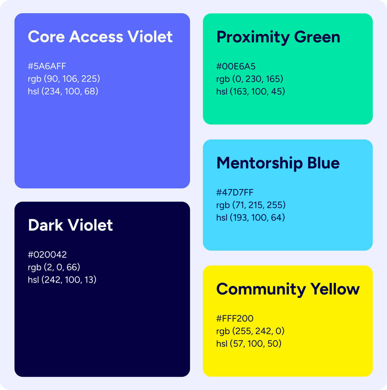
COLOR AS STRUCTURE, NOT DECORATION
Every color has a functional role. The system defines three layers: brand identity, semantic states, and UI structure, with strict rules for when and how each is used.
Core Access Violet = System Identity
Brand anchors, primary CTAs, structure framing. The one color used at every touchpoint without exception.
Green = Proximity & Access
Positive movement, confirmation states, chart growth signals. Used only when the meaning is present.
Blue = Mentorship
Informational context, neutral data, analysis layers. Never decorative.
Yellow = Community
Highlights, anomalies, caution signals, community moments. Highest contrast, used sparingly.
Dark Violet = Structural Inversion
Not a recolor. The same system, inverted. Backgrounds deepen, text flips, brand colors hold identity.
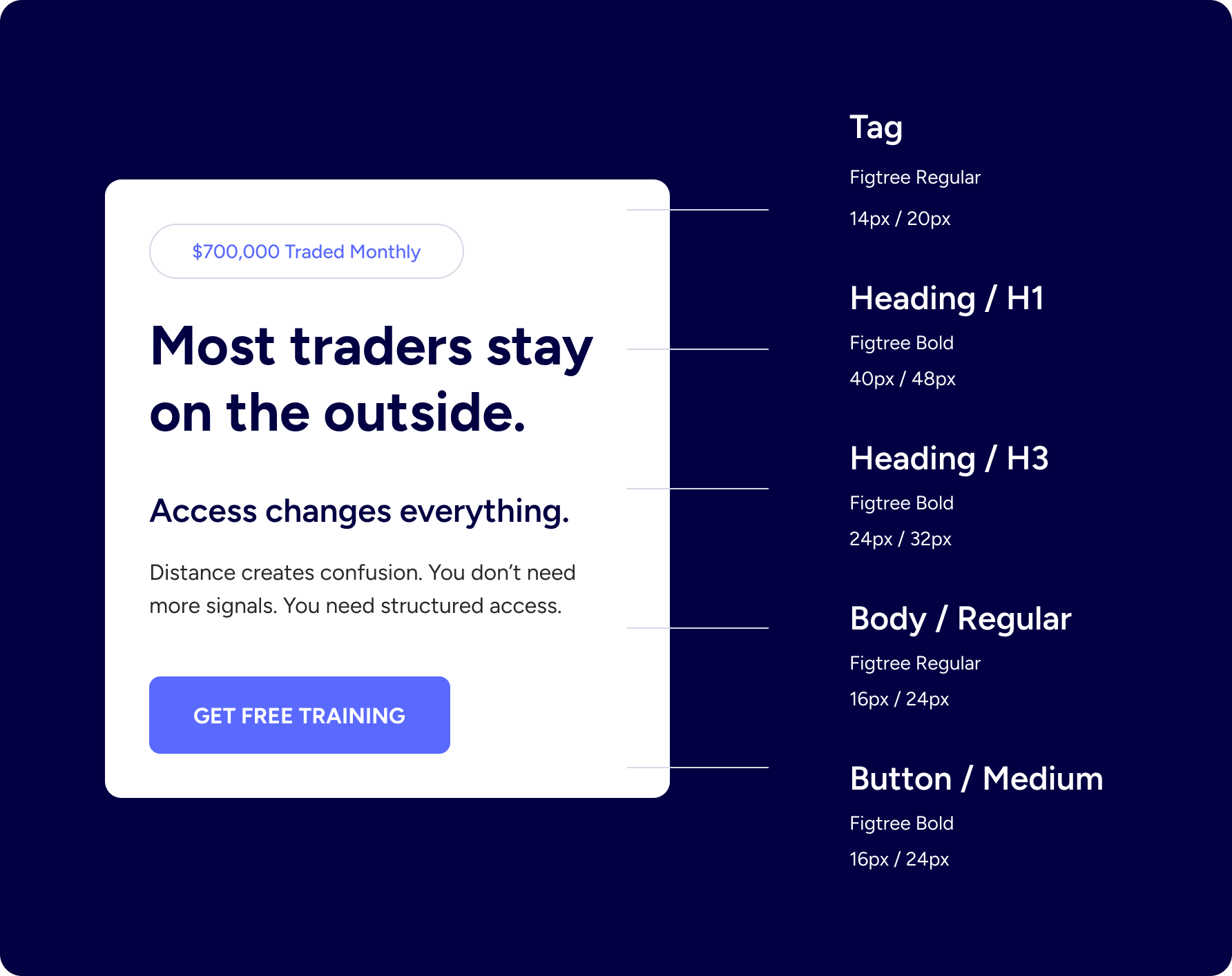
TYPOGRAPHY
DESIGNED FOR CLARITY UNDER PRESSURE
One typeface, Figtree, across every touchpoint: product, marketing, video, web. Hierarchy is achieved through size, weight, and spacing only. Zero stylistic experiments.
FINAL OUTPUT
A COMPLETE BRAND ECOSYSTEM
The project delivered not just a logo and guidelines, but a fully operational system, ready for production, scalable across product and marketing.
Including, but not limited to:
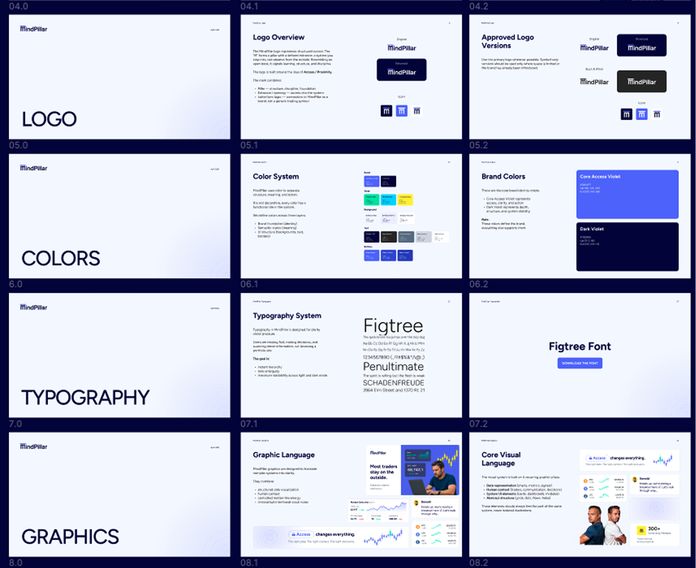
Brand guidelines (V1) — 80 pages, 10 sections|
Figma design system — tokens, components, patterns
Full color system — light + dark mode, semantic states
Typography system — scale, weights, mobile adaptation
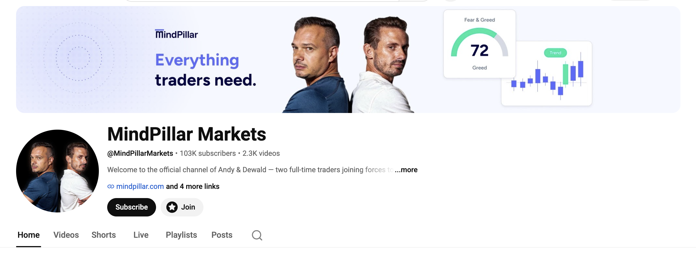
Social media system — IG posts, stories, dark variants
Web system — layout logic, CTA system, card framework
Video system — caption rules, motion language, UI overlays
VISUALS
WHAT THE BRAND LOOKS NOW